
Our grocery retailing client is back with another request! Following our initial Chi-Square Test of Independence test evaluating membership signup rates, leadership now wants to understand how the “Delivery Club” campaign impacted overall customer spending. In this project, we apply Causal Impact Analysis to quantify the net incremental revenue generated by the campaign and isolate true sales uplift from organic baseline trends.
Table of Contents
- 00. Project Overview
- 01. Concept Overview
- 02. Data Overview & Preparation
- 03. Applying Causal Impact Analysis
- 04. Analyzing The Results
- 05. Discussion
Project Overview
Context
In late June, a grocery retailer promoted their new “Delivery Club” membership campaign. For a $100 annual fee, members receive unlimited free grocery deliveries for an entire year, starting July 1st. Having previously evaluated the impact of campaign mailers on signup rates using a Chi-Square Test of Independence, leadership now needs to quantify the financial impact of the program. Specifically, the client wants to determine whether customers who signed up for the Delivery Club increased their spending in the months following the launch and by how much.
Our core business hypothesis is that waiving delivery fees removes purchasing friction, encouraging Delivery Club members to shop more frequently and spend more per order over time. To measure this, we leverage a counterfactual framework using non-member spending behavior. Customers who chose not to sign up should in theory continue their normal shopping habits after July 1st. By calculating average daily sales for this non-member control group, we can establish a reliable baseline prediction of what Delivery Club members would have spent if the program had never existed.
Ultimately, our primary objective is to evaluate average daily spend across both customer cohorts from July 1 through September 30. Comparing actual member transactions against this synthetic baseline allows us to differentiate true campaign uplift from organic market growth and quantify the net incremental revenue directly caused by the membership launch.
Actions
- Environment & Data Setup: Import required analytical libraries (
causalimpact,pandas). Load raw transaction and campaign datasets. - Data Integration & Aggregation: Merge customer transactions with campaign metadata on
customer_idand aggregate daily spend into a unified customer timeseries DataFrame. - Format Model Matrix: Pivot data to generate mean daily spend by group (
signup_flag), explicitly ordering the treatment group (Delivery Club members) into the first column and non-members into the second. - Define Evaluation Windows: Set explicit date boundaries for the pre-intervention baseline period (
2020-04-01to2020-06-30) and post-intervention assessment window (2020-07-01to2020-09-30). - Model Execution: Run the
CausalImpactalgorithm to generate a counterfactual baseline and calculate 95% Bayesian confidence intervals. - Performance Evaluation:
- Utilize
ci.plot()to visually assess daily spending trajectory, cumulative pointwise causal effects, and spend lift over time. - Run
ci.summary()to extract numerical estimates for average daily lift, percentage increase, and total incremental revenue generated.
- Utilize
Results & Discussion
The Delivery Club campaign successfully generated a statistically significant increase in customer spending over the 92-day evaluation window, fully confirming our core business hypothesis.
- Relative & Absolute Lift: Campaign members spent an average of $171.33 per day, compared to an estimated counterfactual baseline of $121.42 per day. This represents an absolute gain of +$49.92 per customer per day, and +41.11% relative uplift in daily spend.
- Top-Line Revenue Contribution: Across all active members over the post-launch window, the program drove $4,592.49 in net incremental revenue ($15,762.69 actual spend vs. $11,170.20 predicted baseline).
- Statistical Certainty: The model confirms a
p-valueofp = 0.0(100% posterior causal probability), confirming with high statistical confidence that the sales uplift was directly caused by the Delivery Club launch rather than random noise or natural circumstances. The 95% Credible Interval bounds the true relative lift between +34.33% and +48.10%.
Concept Overview
Causal Impact Analysis is a statistical method built by researchers at Google in 2014. It predicts what would have happened if a treatment event (known as an intervention) never took place and compares that prediction to what actually happened with the observed data.
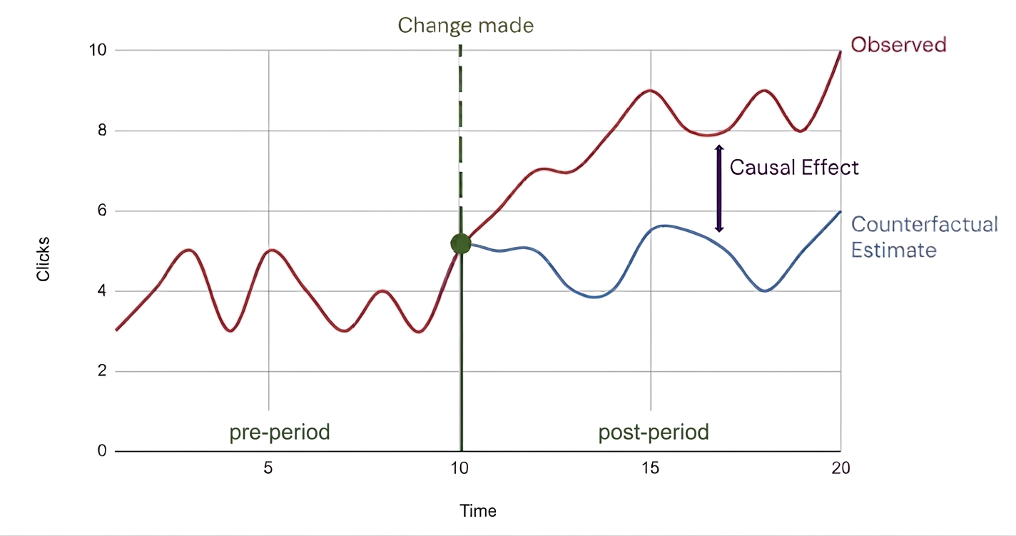
In the example plot image above, the following key components are represented:
- Observed (Red Line): This curve represents the true recorded metric over time, both before and after the “Change Made” treatment event. This is the treatment group.
- Change Made (Vertical Line at t = 10): Represents the exact timestamp at which the treatment event took place. This datapoint separates the pre-period and post-period.
- Pre-period (t < 10): The period of time before the treatment event. This timeframe is used to train the model on the relationship between target and control variables.
- Post-period (t > 10): The period of time after the treatment event where the causal effect is measured.
- Counterfactual Estimate (Blue Line): This curve represents an estimated prediction of what would have happened if the treatment event never occurred. It is created by feeding the CausalImpact algorithm control metrics that are not affected by the event.
- Causal Effect (Purple Vertical Arrow): The delta between the Observed and Counterfactual Estimate curves, representing the absolute lift.
Model Setup Requirements
To run the analysis via the Python causalimpact package, input data must be structured as follows:
- Time Index: A DataFrame indexed by datetime.
- Target Variable (Column 1): The response metric being evaluated (example: daily spend for the treatment group).
- Control Variables (Columns 2+): One or more time series metrics unaffected by the intervention used by the model to construct the counterfactual baseline.
Performance Note for Large Datasets (tfcausalimpact): For multi-year or high-frequency datasets, causalimpact can run slowly. Installing tfcausalimpact optimizes execution by translating your DataFrame into TensorFlow Probability structures (tfp.sts) to drastically accelerate Bayesian computations and avoid deprecation warnings.
Why Use Causal Impact Analysis?
Causal Impact Analysis automatically accounts for trend shifts, seasonality, and historical patterns using Bayesian structural time series models. It also quantifies uncertainty by outputting probabilistic confidence intervals alongside point estimates to make risk and impact clearly measurable.
Data Overview & Preparation
First, import the required packages for data processing and causal impact analysis:
from causalimpact import CausalImpact
import pandas as pd
Next, we’ll import and merge our data tables of interest:
-
The transactions table contains individual customer transactions, with fields such as
customer_id,transaction_date,transaction_id,num_items, andsales_cost -
The campaign_data table contains data from the Delivery Club campaign, tracking which type of mailer each customer received (
mailer_type) and whether they signed up or not (signup_flag).
# Import data tables
transactions = pd.read_excel('data/grocery_database.xlsx', sheet_name = 'transactions')
campaign_data = pd.read_excel('data/grocery_database.xlsx', sheet_name = 'campaign_data')
Because the transactions table tracks data from April through September, daily sales serves as the appropriate time series metric. We group the data by customer_id and transaction_date to aggregate individual daily spending into a new DataFrame: customer_daily_sales. Retaining customer_id at this stage allows us to successfully merge the aggregated sales numbers with our campaign_data table.
# Aggregate sales cost per customer per day
customer_daily_sales = transactions.groupby(['customer_id', 'transaction_date'])['sales_cost'].sum().reset_index()

# Merge data tables on customer_id
customer_daily_sales = pd.merge(customer_daily_sales, campaign_data, how = 'inner', on = 'customer_id')
Below is a 5-row sample of the imported customer_daily_sales DataFrame:
| customer_id | transaction_date | sales_cost | campaign_name | campaign_date | mailer_type | signup_flag |
|---|---|---|---|---|---|---|
| 4 | 2020-04-01 00:00:00 | 193.96 | delivery_club | 2020-07-01 00:00:00 | Mailer1 | 1 |
| 5 | 2020-04-01 00:00:00 | 755.77 | delivery_club | 2020-07-01 00:00:00 | Mailer2 | 1 |
| 22 | 2020-04-01 00:00:00 | 21.83 | delivery_club | 2020-07-01 00:00:00 | Control | 0 |
| 37 | 2020-04-01 00:00:00 | 53.72 | delivery_club | 2020-07-01 00:00:00 | Mailer1 | 0 |
| 42 | 2020-04-01 00:00:00 | 319.36 | delivery_club | 2020-07-01 00:00:00 | Mailer1 | 1 |
To prepare the dataset for the CausalImpact algorithm, the customer_daily_sales DataFrame must meet the following requirements:
- Datetime Index: The rows must be uniquely indexed by a continuous datetime sequence.
- Column Ordering: The first column must represent the Target Variable (treatment group metric), followed by one or more Control Columns (unaffected baseline series).
To achieve this, we can first pivot customer_daily_sales into a new DataFrame to aggregate average daily spend across both customer groups: members who signed up for the Delivery Club (signup_flag = 1, treatment) and members who did not (signup_flag = 0, control).
causal_impact_df = customer_daily_sales.pivot_table(index = 'transaction_date',
                                                    columns = 'signup_flag',
                                                    values = 'sales_cost',
                                                    aggfunc = 'mean').round(2)

# Define frequency for our DateTimeIndex ("D" = daily)
causal_impact_df.index.freq = "D"
| transaction_date | 0 | 1 |
|---|---|---|
| 2020-04-01 | 74.46 | 194.49 |
| 2020-04-02 | 75.56 | 185.16 |
| 2020-04-03 | 74.39 | 118.12 |
| 2020-04-04 | 63.00 | 198.53 |
| 2020-04-05 | 72.44 | 145.46 |
Now that causal_impact_df is indexed by unique transaction_date, the two columns must be rearranged so that the impacted treatment group data occupies the first column position.
# For causal impact we need the impacted group in the first column (see required columns)
causal_impact_df = causal_impact_df[[1,0]]

# Rename columns for clarity
causal_impact_df.columns = ["member", "non_member"]
Now, the causal_impact_df input data is correctly formatted and ready for model fitting:
| transaction_date | member | non_member |
|---|---|---|
| 2020-04-01 | 194.49 | 74.46 |
| 2020-04-02 | 185.16 | 75.56 |
| 2020-04-03 | 118.12 | 74.39 |
| 2020-04-04 | 198.53 | 63.00 |
| 2020-04-05 | 145.46 | 72.44 |
Applying Causal Impact Analysis
Before running the CausalImpact algorithm, the pre_period and post_period must be defined in addition to the causal_impact_df input.
The pre_period represents the baseline timeframe prior to the Grocery Club campaign being launched. The post_period spans the timeframe immediately following the campaign launch.
Note on dataset: Although the campaign memberships last for a year, the available transactions data ends on 2020-09-30, defining the limit of the post_period evaluation window.
# Time period before the Delivery Club campaign
pre_period = ["2020-04-01","2020-06-30"]
# Evaluation window after campaign launch
post_period = ["2020-07-01","2020-09-30"]

# Fit the Causal Impact model
ci = CausalImpact(causal_impact_df, pre_period, post_period)
Running this code fits the CausalImpact model and stores the statistical output inside the ci object. To evaluate the campaign’s performance, the following core methods will be used: .plot() to visualize the counterfactual trajectory and .summary() to quantify the absolute lift.
Analyzing The Results
Executing ci.plot() generates a three-panel visualization. Across all three subplots, the vertical dashed black line denotes the intervention date (2020-07-01), separating the model’s training window (pre-period) from the assessment window (post-period).
ci.plot()
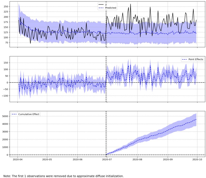
- Original vs. Counterfactual (First subplot):
- Observed Data (
'y', Solid Black Line): Shows the true recorded average daily sales for customers who joined the Delivery Club. - Counterfactual Prediction (
'Predicted', Blue Dashed Line): Represents the estimated average daily spend if those customers had never joined the campaign. - Confidence Interval (Shaded Purple Region): Illustrates the 95% posterior probability interval around the prediction, which is the
CausalImpactdefault. - Takeaway: Post-intervention, observed daily spend (
'y') consistently trends above the baseline prediction, indicating a clear positive lift from the membership launch. Because the actualpost-periodspend consistently breaches the upper boundary of the purple band, we can conclude that the observed uplift in sales is statistically significant and extremely unlikely to be due to random noise.
- Observed Data (
- Point Effects (Second subplot):
- Displays the daily delta between actual observations and the counterfactual baseline.
- In the
pre-period, point effects hover around zero as expected, verifying strong baseline alignment. - In the
post-period, daily point effects jump into positive value territory, demonstrating that daily sales consistently surpassed expected baselines.
- Cumulative Effect (Third subplot):
- Aggregates daily pointwise uplift over time into a running cumulative sum.
- The steady upward slope throughout July, August, and September confirms that the campaign generated compounding incremental revenue, leading to several thousand dollars of total lift by the end of the evaluation window.
From a first look at the ci.plot, it seems as though customers who signed up for the campaign ended up spending more daily indicating a successful campaign!
We can further support our statistical prediction by running the ci.summary() functionality; this will help quantify the exact magnitude and statistical significance of the plotted lift:
# Extract the summary statistics & report
print(ci.summary())

>> Posterior Inference {Causal Impact}
                          Average            Cumulative
Actual                    171.33             15762.69
Prediction (s.d.)         121.42 (4.26)      11170.2 (392.29)
95% CI                    [112.93, 129.65]   [10389.73, 11927.46]

Absolute effect (s.d.)    49.92 (4.26)       4592.49 (392.29)
95% CI                    [41.69, 58.4]      [3835.23, 5372.96]

Relative effect (s.d.)    41.11% (3.51%)     41.11% (3.51%)
95% CI                    [34.33%, 48.1%]    [34.33%, 48.1%]

Posterior tail-area probability p: 0.0
Posterior prob. of a causal effect: 100.0%

For more details run the command: print(impact.summary('report'))
This output summary table breaks down the evaluation window into two key dimensions: Average (daily per-customer metrics) and Cumulative (total aggregate metrics over the post-period)
Average Daily Impact:
- Actual vs. Predicted: Delivery Club members spent an average of $171.33 per day during the post-period, compared to a predicted counterfactual baseline of $121.42.
- Absolute Effect: The campaign drove an incremental daily lift of $49.92 per member ($171.33 - $121.42).
- Relative Effect: This daily lift represents a 41.11% proportional increase in average daily spending over baseline expectations.
Cumulative Total Impact:
- Across the entire 92-day post-period evaluation window, total actual spend for all campaign members reached $15,762.69, compared to the expected counterfactual total of $11,170.20.
- This yields a total net incremental revenue generated by the campaign of $4,592.49.
Statistical Significance & Uncertainty:
- Confidence Intervals: The model establishes a 95% Credible Interval bounding the true relative lift between +34.33% and +48.10%. Reporting these bounds gives stakeholders a clear safety margin, confirming that even under the most conservative scenario, the campaign delivered at least a 34% sales boost.
- P-Value & Causal Certainty: The model reports a
p-valueofp = 0.0(100% causal probability). This confirms with extreme statistical certainty that the revenue jump was directly caused by the Delivery Club launch, rather than random noise or normal shopping fluctuations.
Discussion
Business Impact & Strategic Implications
The true value of Causal Impact Analysis lies in isolating real incremental gains from baseline sales trends. Standard transactional reporting would credit the entire $15,762.69 post-period spend to the Delivery Club. However, by constructing a synthetic counterfactual ($11,170.20), we isolated the true top-line contribution of the initiative to $4,592.49 in net incremental revenue.
Waiving delivery fees effectively removed purchasing friction for active members, driving an absolute gain of +$49.92 per customer per day through higher transaction frequencies and larger order values across the 92-day evaluation window.
From a financial planning perspective, this $4,592.49 net revenue lift serves as the exact top-line figure leadership needs for ROI modeling. By comparing this revenue gain directly against campaign execution costs (such as promotional mailer printing, delivery fee subsidies, and operational logistics) the business can measure exact campaign profitability and determine long-term program sustainability.
Next Steps
- Financial Planning & ROI Modeling: This $4,592.49 net revenue lift provides leadership with the precise top-line baseline required to evaluate overall campaign ROI against marketing costs, delivery fees, and operational expenses.
- Customer Lifetime Value (LTV) Tracking: Extend the post-intervention evaluation window as additional transaction history becomes available to assess retention rates and determine whether daily spending lift persists throughout the full membership year.
- Custom Plot Formatting: Enhance default
ci.plot()outputs using custommatplotlib.pyplotstyling to generate stakeholder-ready visualizations with clear color palettes, axes labels, and explicit legend labels.